
Usage Experience Optimization
Improving spending visibility and helping users better understand their monthly usage

Case
Overcoming System Latency & Aligning Fintech Mental Models
01. The Strategic Challenge
For Paidy Plus users, the core dashboard serves as the central hub for monitoring spending behavior, remaining credit limits, and upcoming repayment schedules. However, user research and customer support tickets revealed a significant mental model mismatch: users routinely struggled to parse what they had already spent versus what was actively due, driving an increase in account inquiries.
The core challenge was structural system latency: for auto-debit users in Japan, payment confirmation from banks takes several business days post-deduction. During this dead-zone window, the dashboard displayed data that users assumed was already cleared. The goal was to re-architect the information topology to match the financial mental model of the user, entirely resolving comprehension drop-offs without altering underlying banking infrastructure.
My Role: Senior Product Designer (UX Research, Information Architecture, Data-Informed Usability Testing).
The Goal: Simplify financial data visibility, isolate current-month spending actions, and reduce customer support volume.
02. The UX Strategy: De-fragmenting Financial Status
Japanese digital consumers show an exceptionally high preference for direct, explicit clarity regarding outstanding liabilities. Confronting them with mixed data arrays (like historical spending graphs overlapping with current credit limits) causes immediate cognitive fatigue.
Key UX Interventions:
Isolating Current-Month Liabilities: I stripped away overlapping data markers from the primary view graph, elevating the active month's exact outstanding total as the primary anchor point. This immediate focal change reduced the need for users to manually scan and compute historical timelines.
Designing for Banking Latency (The Status Loop): To handle the processing delay without altering backend systems, I introduced contextual status indicators during the banking transition window. This visual cushion clearly separated "Pending Bank Processing" from "Available Credit Limit," removing user panic.
Streamlining Terminology Governance: Fintech terms can easily overwhelm non-technical users. I standardized the microcopy, ensuring terms related to credit pools remained distinct from immediate monthly settlement amounts, significantly lowering cognitive friction.
03. Interaction Architecture & Framework
I analyzed the gaps between system logic and user interpretation, restructuring the workspace to guide the user naturally from immediate tasks down to broader credit limits.
[System Settlement Data] ──► [Isolate Active Month] ──► [Address Processing Latency] ──► [Clear Financial Action]
By mapping layout explorations across two core structural options, we finalized a setup that split active monthly liabilities from long-term credit tracking, successfully keeping users focused on their immediate financial context.
04. Business & Engineering Impact
Redesigning the information hierarchy provided immediate relief to our operational support infrastructure while markedly boosting interface usability. By matching the dashboard's layout to user mental models, we turned a confusing system-processing gap into a transparent, guided experience.
The updated interface was validated through rigorous user prototype evaluations, demonstrating that users could accurately calculate their remaining credit and active monthly spending limits significantly faster. By delivering this impact purely through strategic visual updates rather than a complete backend refactor, the project achieved immediate implementation feasibility, successfully protecting core metrics while driving a measurable reduction in payment-status support inquiries.
Senior Takeaway: Financial interfaces frequently fail not because information is missing, but because too many data points compete for attention. By designing for system latency and structuring data around the user’s immediate questions, we successfully transformed a complex technical constraint into a secure, low-friction dashboard experience.
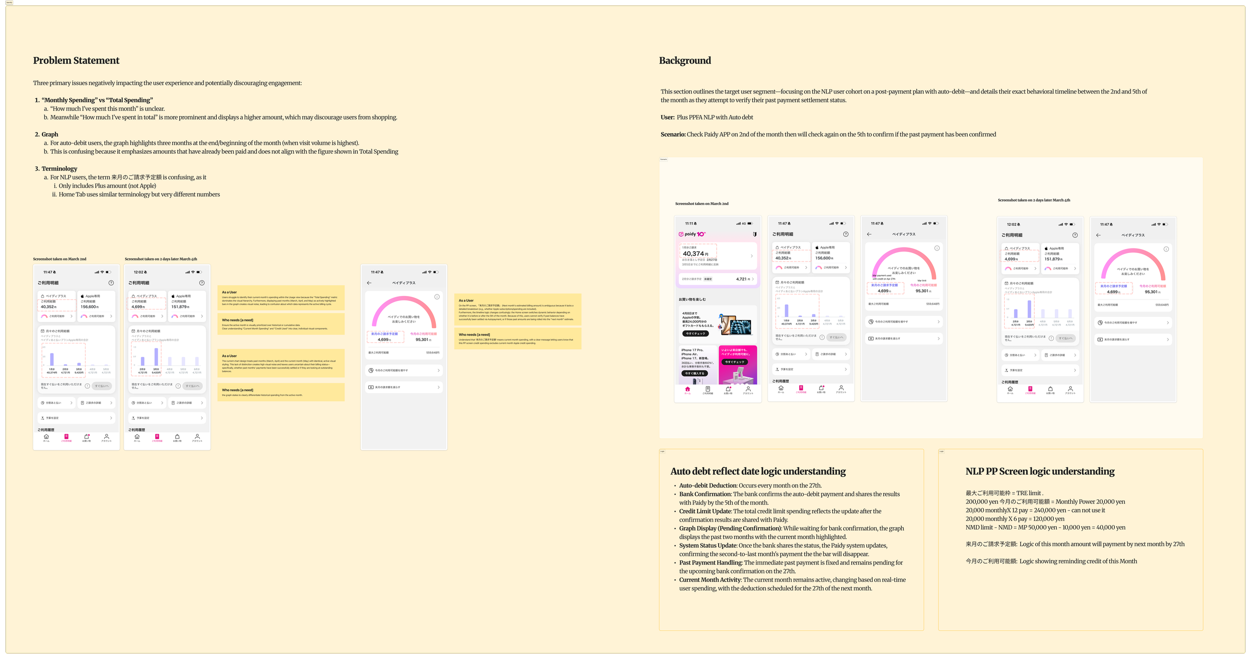
To understand the root causes of user confusion, I analyzed payment timelines, user behavior, and NLP business logic to identify gaps between how the system worked and how users interpreted their spending and payment status.
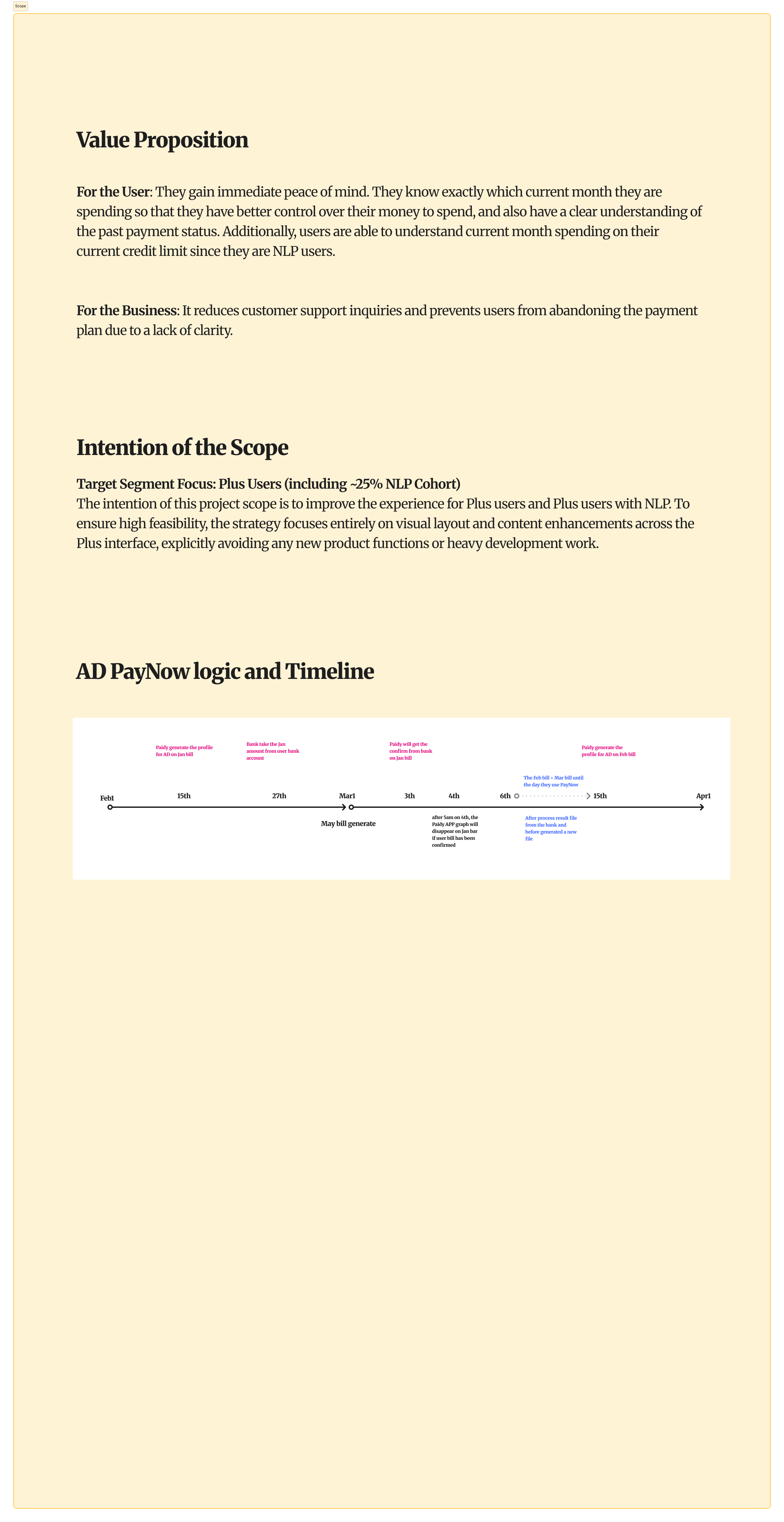
After identifying the root causes of confusion, I defined a focused scope that prioritized clarity and comprehension for Plus and NLP users while staying within existing product and technical constraints.
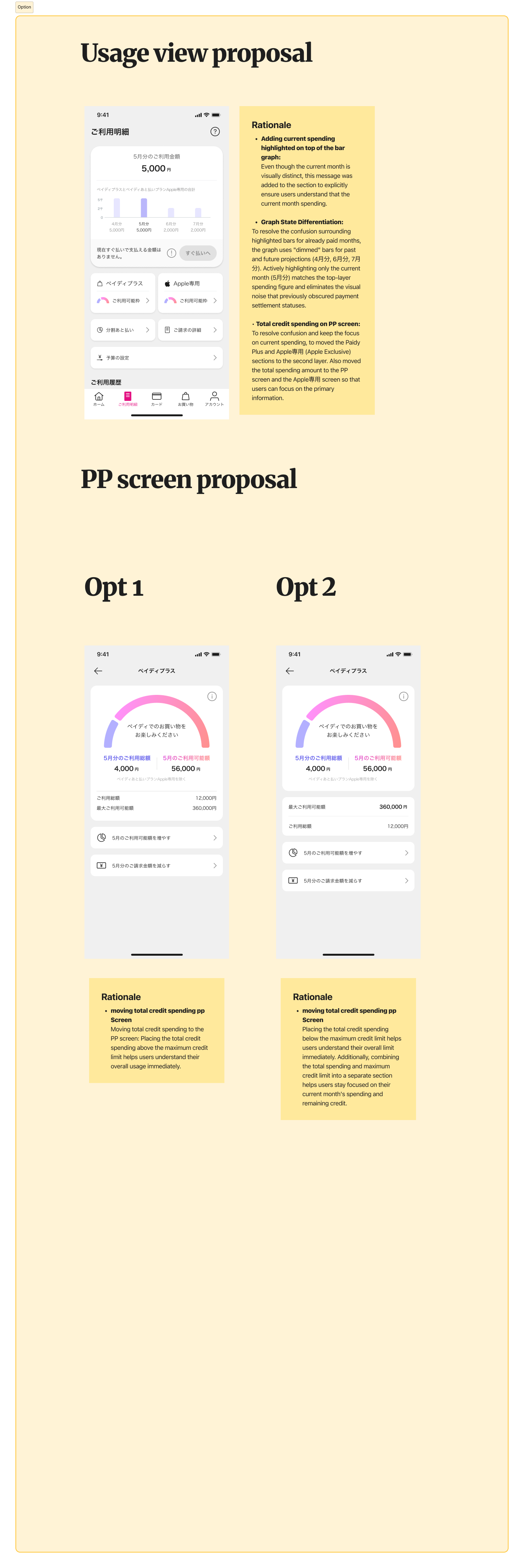
Based on the identified pain points, I explored several layout and information hierarchy approaches to help users quickly understand their current spending, payment status, and available credit.
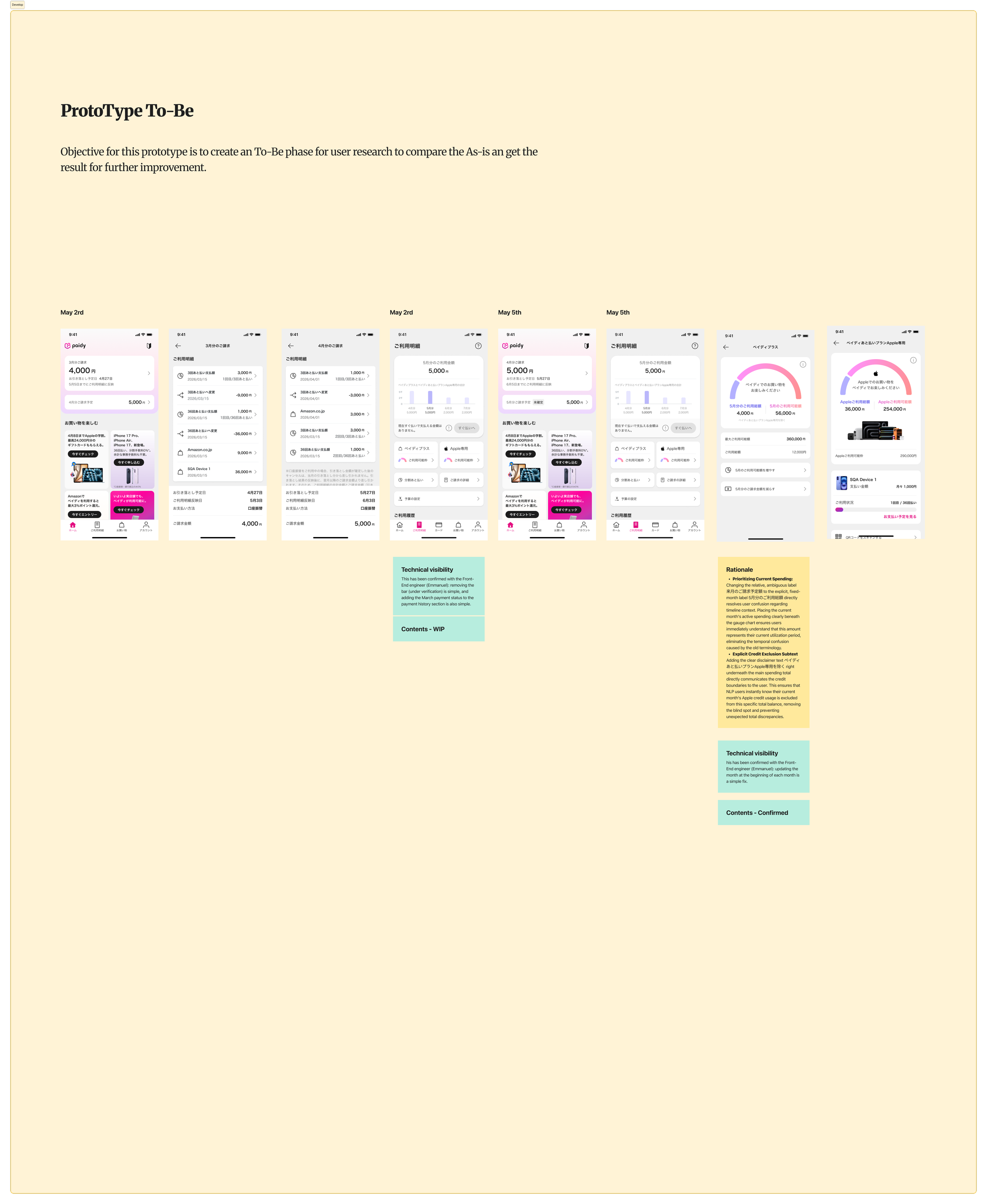
To validate that the To-Be design improved user understanding and usability, I conducted A/B testing against the existing experience and presented the findings to stakeholders, securing alignment, sign-off, and approval to move forward with development.