
Rakuten Travel
Case
Modernizing High-Density Legacy Systems Without Disrupting Power Users
01. The Strategic Challenge
Rakuten Travel stands as one of Japan’s largest legacy booking ecosystems, serving millions of active users. However, the core platform layout had operated for nearly two decades without a foundational UX overhaul. The interface suffered from immense information density, fragmented multi-step filtering logic, and overwhelming visual noise that complicated the discovery journey.
The primary strategic challenge was balancing modern simplification with legacy muscle memory. In Japan, drastically cleaning up an interface often triggers a backlash from power-users who rely on high data-density to evaluate options. The objective was to modernize the end-to-end Search → Listing → Selection funnel to lower cognitive overload, while ensuring the updated system maintained the structural trust and conversion rates expected by the local market.
My Role: Lead UX/UI Product Designer (UX Audit, User Research, Interaction Redesign, Usability Validation).
The Goal: Simplify the high-complexity search path, establish clear filtering hierarchy, and boost booking conversion confidence.
02. The UX Strategy: Structuring Choice Architecture
Travel booking in a mature market like Japan isn't a discovery issue—it is a filtering and comparison problem. Users do not want fewer choices; they want an interface that helps them sort through options without feeling overwhelmed. I approached the redesign across three distinct structural focus areas:
03. Interaction Pipeline & Testing Lifecycle
I mapped out our complete evaluation methodology, running quantitative data analyses and design thinking workshops to guide our high-fidelity layout explorations.
[Legacy Dense Matrix] ──► [Data Audit & Workshops] ──► [Scannable Layout Options] ──► [SUS Validation]
By subjecting our updated prototypes to iterative user feedback loops, we ensured that our structural changes simplified the layout for new users while remaining fully intuitive for existing Rakuten account holders.
04. Business & Usability Impact
The modernized design architecture successfully simplified the choice selection funnel, proving that high data-density products can be streamlined without sacrificing their depth of information.
By grounding our design changes in rigorous qualitative testing, the final prototype achieved a stellar System Usability Scale (SUS) score improvement of +8.3 points, translating to an 80%+ leap in platform usability benchmarks. The streamlined search architecture and improved filtering patterns successfully cut down the time users spent finding relevant listings, directly protecting business revenue while creating a highly scalable UX blueprint for Rakuten's future digital properties.
Senior Takeaway: True senior design leadership means respecting legacy ecosystems rather than blindly applying Western minimalist trends. By understanding how the Japanese consumer scans high-density information, we modernized a 20-year-old interface into a clean, highly successful experience that honors user habits while optimizing business conversion performance.
Action - Details
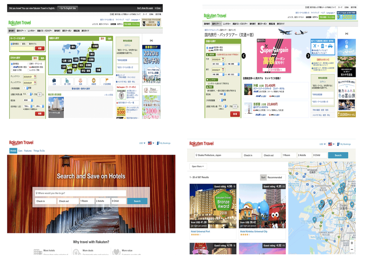
Current website
Over 20 years without any upgrade and improvement

Data analysis
Example of analysis report

workshop
Design Thinking workshop example

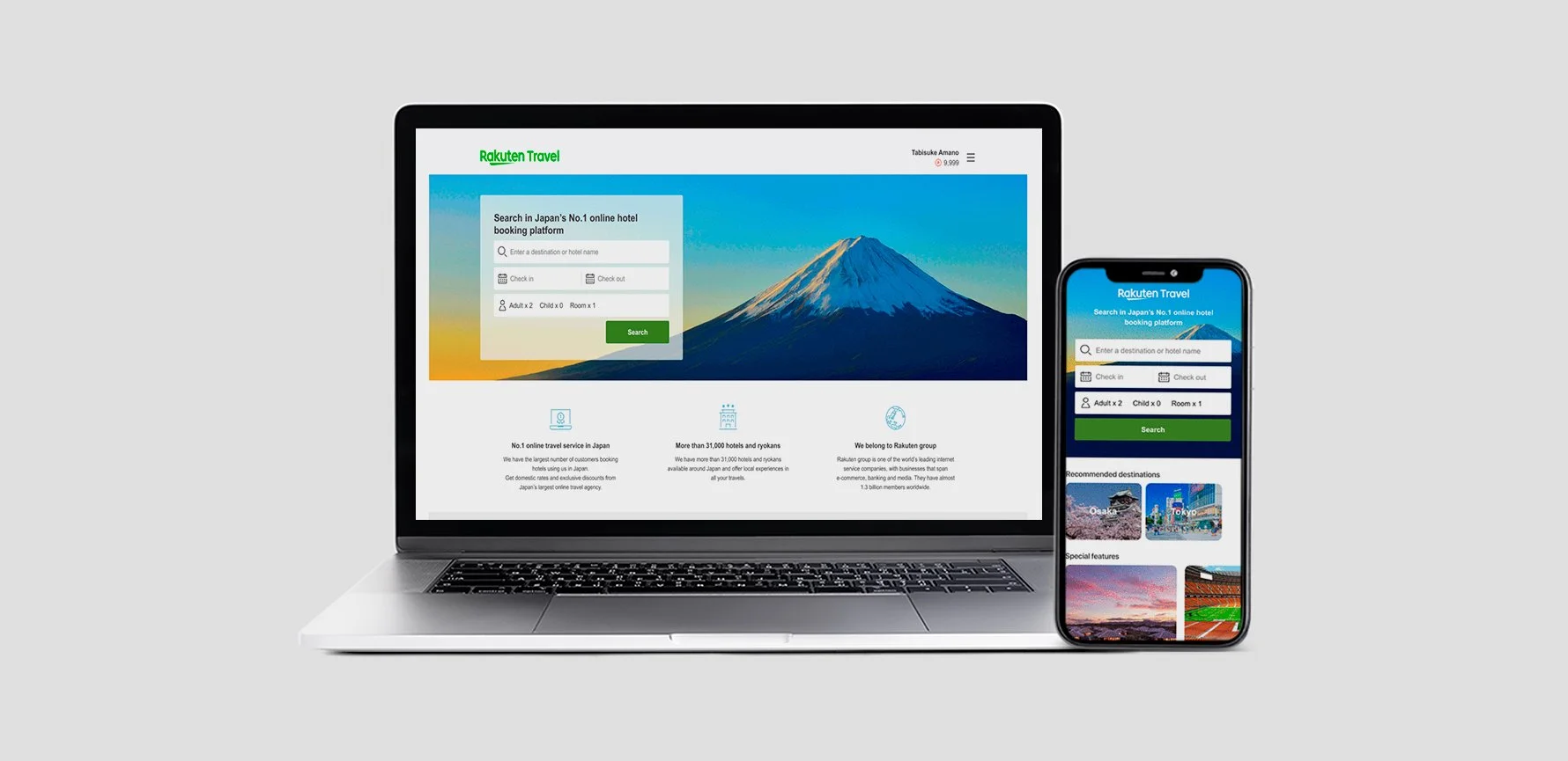
Design prototype
Example of Hight-fidelity wireframe

Usability Testing
Example of the qualitative usability testing
Result - after in person usability testing
The SUS score at 8.3 point with over 80% improvement.