
Redesigning the Merchant Dashboard
Redesigned the Merchant Dashboard around real merchant workflows, improving navigation, increasing feature discoverability, and establishing a scalable information architecture and reusable component library.
Timeline: 6 months
Platform: Web
Stakeholders: Product, Engineering, Research, Customer Support, and Business
My Ownership: I led the dashboard UX redesign, mapped merchant workflows, restructured navigation, and designed reusable UI components. Product, Engineering, Research, Customer Support, and Business partners contributed requirements, merchant feedback, feasibility input, and validation.
My Role: Senior UX Designer
Responsibilities: Product Discovery, Information Architecture, Interaction Design, Component Design, Prototyping, and Usability Testing
The Challenge
Merchants relied on the dashboard to manage important daily business activities. As the product expanded and new features were introduced, its navigation structure became increasingly difficult to understand.
Frequently used functions were harder to find, newly released features received limited visibility, and inconsistent menu labels increased the effort required to complete everyday tasks.
The challenge was to simplify the existing experience while creating a flexible structure that could support future product growth.
Business Goals
Improve merchant task efficiency
Increase discoverability of existing and newly introduced features
Simplify navigation around merchant workflows
Establish a scalable information architecture
Improve consistency between Design and Engineering
Support future product expansion without increasing complexity
Discovery
I collaborated with Product, Customer Support, Engineering, and business stakeholders to review:
Merchant feedback and support inquiries
Existing navigation patterns
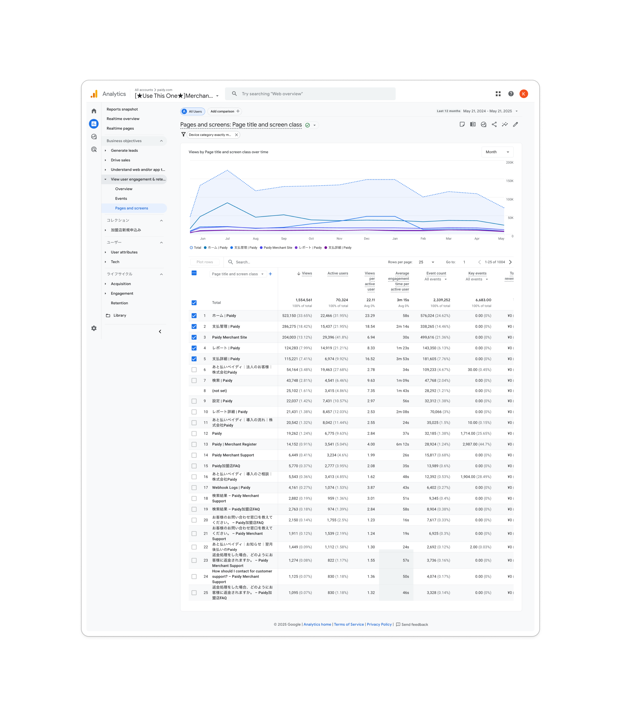
Feature usage and discoverability
Menu labels and content hierarchy
Product requirements and planned expansion
Existing UI patterns and implementation constraints
The research showed that the main usability issues were not limited to individual screens. They resulted from how information and functionality were organized throughout the product.
Key Insights
1. Navigation no longer reflected product growth
The original structure was not designed to accommodate the increasing number of merchant features.
2. Important features were difficult to discover
Merchants relied on familiar workflows and often overlooked useful functionality that was buried in the navigation.
3. Labels and menu groupings lacked consistency
Inconsistent terminology and hierarchy made it harder for merchants to predict where functions were located.
4. Product growth was increasing design complexity
Without a scalable structure and reusable components, each new feature risked adding further inconsistency.
These insights shifted the project from redesigning individual screens to improving the dashboard’s overall product architecture.
Product Strategy
Workflow first: Group features around merchants’ daily tasks and use consistent, predictable labels.
Discoverability: Place useful features within relevant journeys while preserving familiar interaction patterns.
Scalability: Use a shared information architecture and component library so product growth adds less inconsistency.
Design Exploration
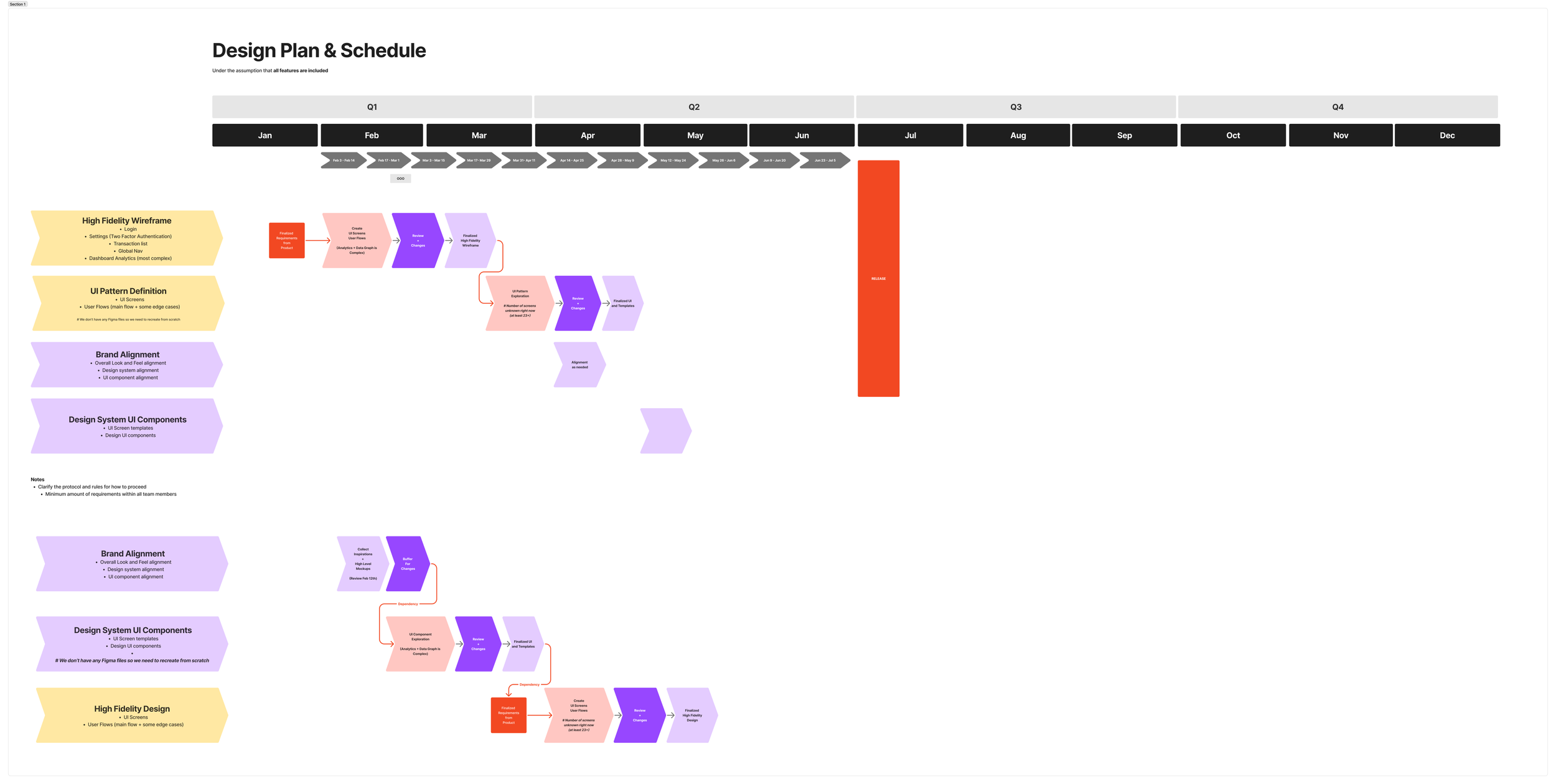
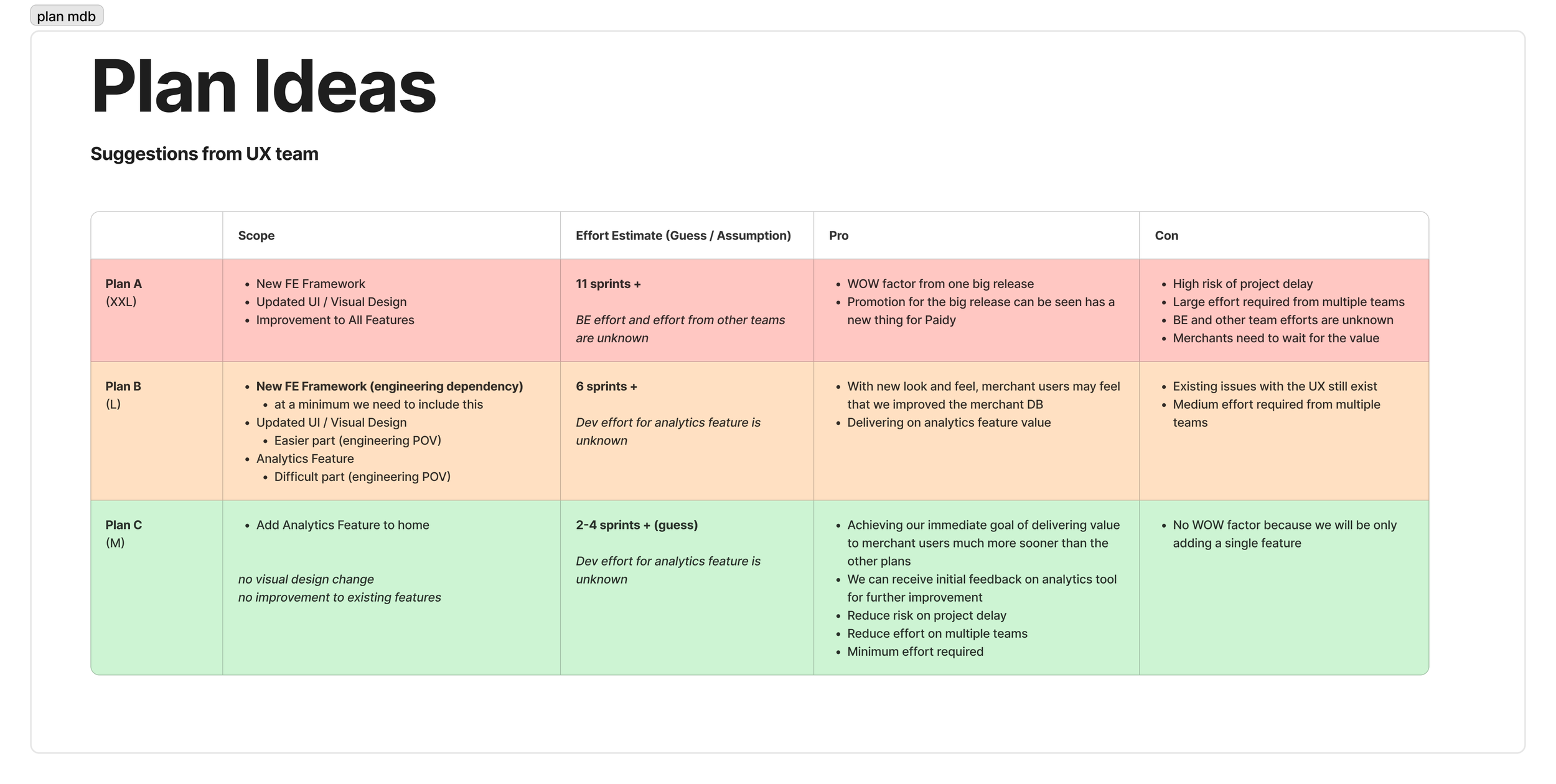
What I compared: Navigation directions were evaluated for frequent-task access, feature visibility, menu depth, labeling, familiarity, and room for future features.
Why this direction: Workflow-based grouping improved clarity while retaining familiar patterns for existing merchants.
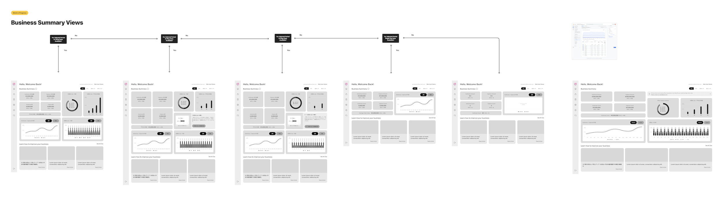
Visual comparison: The five-screen iteration strip below shows dashboard composition across versions. Compare the summary cards, chart placement, and guidance area; these are design iterations, not experiment variants.
The Solution
1. Information hierarchy: The dashboard iterations group summary figures, charts, and guidance into distinct cards. This separates a quick business overview from the supporting detail.
2. Action emphasis: Magenta accents draw attention to actions and guidance within a mostly neutral interface. The iteration strip shows how promotional guidance and business information share the same layout.
3. Component consistency: The component overview below documents the building blocks used to compose the interface. Reusing these patterns gave Design and Engineering a shared reference as the platform expanded.
4. Navigation decisions: I grouped related features around merchant workflows and standardized labels, informed by merchant feedback on the existing dashboard and review of the proposed design.
Inspect the design: Click the order-detail screen, component overview, or dashboard iteration strip to open a larger view. Compare card grouping, action placement, and content density across the iterations.
Validation
Research question: Did the proposed dashboard address the usability issues merchants experienced in the existing product?
Method and sample: Ten merchants shared feedback on the old dashboard’s usability and reviewed the proposed design. This was a design review informed by existing-product experience.
Finding → design decision: Merchants expected daily tasks to be grouped by workflow. Their feedback informed revisions to menu grouping, terminology, and hierarchy before launch.
Quantitative feedback: The refined design received an average satisfaction rating of 4.5 out of 5. This is a feedback rating, not a System Usability Scale score or a timed performance measure.
My contribution: I led the dashboard redesign and translated merchant feedback into navigation and component revisions with cross-functional partners.
After launch: The Merchant and Data Science teams monitored behavior to identify phase-two improvements. Post-launch performance results are not included in this public case.
Business Impact
Product outcome: Established workflow-based navigation, clearer labels, and reusable UI components to support consistent product expansion.
Research outcome: Feedback from ten merchants informed revisions before launch. The refined design received an average satisfaction rating of 4.5 out of 5.
Measurement context: The study compared feedback on the existing dashboard with review of the proposed design. It did not measure navigation time. Post-launch monitoring with Data Science supported planning for phase two; performance results are not shown here.
Key Learnings
As digital products grow, usability problems often result from how functionality is organized rather than from the quality of individual features.
Treating information architecture as a strategic product decision helped the team improve the current merchant experience while also creating a stronger foundation for future expansion.