
Merchant Dashboard Redesign
Transforming a legacy merchant portal into a scalable product experience through research, stakeholder alignment, and strategic planning
Case
Merchant DB Improvement
01. Discover & Define: The Catalyst for Change
A successful redesign never starts with aesthetics; it starts with identifying real friction. We kicked off this project by looking at our data to understand where merchants were struggling and where our product was falling short.
Uncovering Friction with Data
We initiated our discovery phase by pulling quantitative usage metrics using Google Analytics, as documented in Analytics.png. By evaluating data across various browsers, device categories, screen resolutions, and operating systems, we pinpointed exact drop-off coordinates and technical constraints where merchant engagement was dipping.
Mapping the Merchant Experience
To turn this raw telemetry into human-centered problems, we built out a comprehensive strategy board shown in CJ mapping.png:
The Persona: We defined our primary user, "Yumi Watanabe (The Data Analyst)," mapping out her explicit demographics, goals, and behaviors.
Jobs-to-be-Done (JTBD) & HMWs: We framed our core design challenges around clear user jobs, asking How Might We help merchants navigate complex transaction data and adopt core payment features with absolute confidence?
Customer Journey Mapping: We mapped the merchant journey across four core phases: Sign Up, Setup, Search, and Report. This exposed critical pain points—such as steep setup loops and dense, unoptimized search tables.
02. Competitive Benchmarking: Looking Outward
To ensure our solutions felt intuitive, we conducted an extensive competitive audit to understand existing industry mental models and standard UI patterns.
As captured in benchmarking.png, we audited industry-leading payment and e-commerce platforms including Stripe, Shopify, PayPay, and Komoju. This benchmarking exercise focused heavily on:
How competitors handle complex dashboard onboarding layouts.
Standard data visualization structures for daily and monthly payouts.
Transaction search filters and dense reporting structures that merchants rely on daily.
03. Stakeholder Alignment & Structural Architecture
Armed with data and competitive insights, the next hurdle was securing cross-functional buy-in and establishing a solid operational foundation before jumping into high-fidelity design.
Pitching the Strategy
In share the report and ideas.png, we visualized our presentation alignment deck used to get executive and product stakeholders on the same page. We proposed a phased approach focusing on:
Home Before/After Setup: Creating distinct dashboard states to dramatically accelerate onboarding and feature adoption.
Business Analytics & Tips: Surfacing contextual tools to drive awareness and adoption of key features like NPay.
Payment Management Search: Redesigning dense tables to fit seamlessly into the customer's daily workflow.
Structuring the Information Architecture
Once aligned on the strategy, we mapped out the foundational skeleton of the dashboard. As seen in IA.png, we mapped the entire ecosystem under the "Merchant Website" directory, clearly organizing existing navigation flows against newly introduced feature spaces (Home, Payment Management, Reports, APIs, and Settings).
Low-Fidelity Layout Exploration
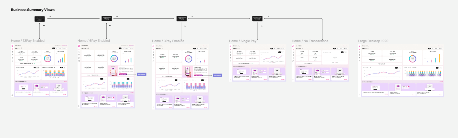
With the architecture locked in, we began running layout sprints. In wireframe.png, we drafted initial low-fidelity wireframes to experiment with desktop dashboard layouts, summary views, "1st of Month" data constraints, and responsive viewport behavior for large 1920px monitors.
04. UI Design System Exploration & Sprints
Before committing to production-ready screens, we entered a collaborative high-fidelity exploration phase to test various UI components and design directions against real-world use cases.
As shown in UI Com explor.png, we grouped our design variations into distinct functional categories for review:
Login & Authentication: Structuring secure entry touchpoints.
API & Report Ecosystems: Testing how dense programmatic data looks when translated into merchant templates.
Payment Management & Tips: Iterating on optimal row density, filter positioning, and contextual helpful hints.
05. Final Delivery: The Scalable System & End-to-End Flows
The final phase of our journey transformed these concepts into a production-ready interface built on a strict atomic design methodology, ensuring long-term scaling and developer alignment.
Foundational Atoms          Organism Templates          End-to-End Flows
 [ Hint Blocks ]              [ Report Cards ]            [ Sign-Up Flows ]
 [ Data Donuts ]    --->      [ Dense Tables ]    --->    [ Error States  ]
 [ Line Charts ]              [ Metric Views ]            [ Happy Paths   ]
Building the Atomic Foundations
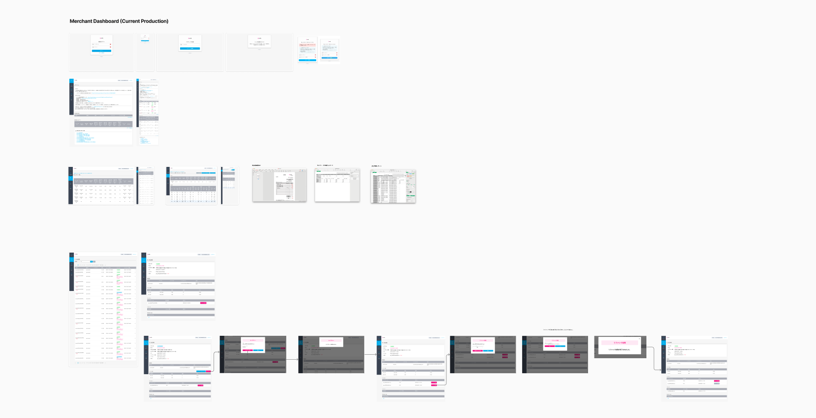
Atoms (Atom com.png): We established the baseline building blocks of the UI. This included NPay upsell containers, interactive micro-copy hints, notifications, and modular data visualization assets (such as line graphs, bar charts, and progress rings).
Organisms (organism com.png): We combined these atoms into cohesive, reusable design patterns. This resulted in production-ready API layout components, report templates, dense payment tables, and contextual home screen variations tailored to the user's journey status (e.g., Home Day 1 for new users vs. Home Day 3 for active merchants).
Complete User Flows & Edge Cases
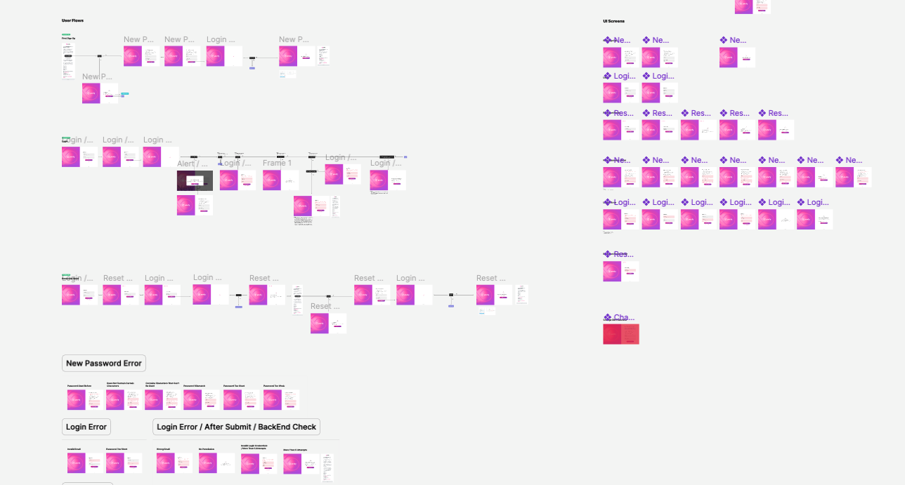
The ultimate blueprint handed off to engineering is detailed in UI flow UI screen.png. Rather than just handing off static layouts, we mapped out the complete, connected user journey screens. This included mapping every complex logic branch—from ideal happy paths to vital edge cases like New Password Error validations, Login Errors, and backend verification states.
06. The Impact & Reflection
By anchoring this redesign in real Google Analytics data, establishing strict alignment via Customer Journey Maps, and executing a system built cleanly from Atoms to complete UI flows, we successfully transformed a fragmented dashboard into a cohesive, merchant-centric business hub. The platform didn't just get a visual upgrade—it gained a scalable UX ecosystem equipped to evolve alongside our growing merchant network.
Quantitative Performance (Google Analytics Data): Analyzed page access, device categories, screen resolutions, and OS telemetry to pinpoint the exact drop-off coordinates where merchant engagement dipped.
Qualitative Friction (Customer Support Data): Reviewed CS ticket trends to identify recurring operational hurdles, highlighting user frustration around steep onboarding learning curves and multi-step workflows.
User Interviewing (Direct Merchant Feedback): Conducted direct user interviews to understand the daily behaviors, workflows, and motivations of our core persona, converting abstract telemetry into human-centered pain points.

Release Scope & Functional Definition: Defined the Minimum Viable Product (MVP) core features versus future-phase improvements, ensuring critical user pain points were addressed first without bloating the development cycle.
Development Prioritization: Utilized a strategic prioritization matrix to evaluate design solutions against engineering complexity and business impact, establishing a clear sequence for component handoff and build pipelines.
Timeline Execution: Locked in cross-functional delivery milestones and sprint allocations across design, product management, and engineering teams to ensure a seamless, predictable release cadence.
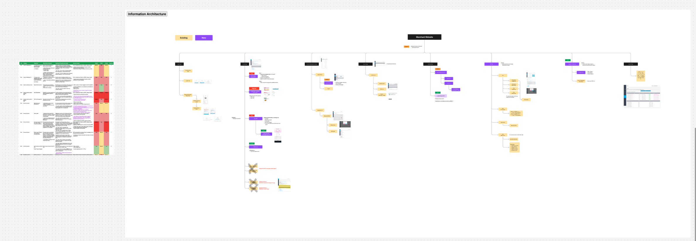
Feature Feasibility Matrix: Evaluated core user requirements against operational impact, complexity, and priority—aligning cross-functional requirements before structural layout design.
Information Architecture Expansion: Structured a comprehensive visual sitemap under the "Merchant Website" directory, clearly segregating legacy navigation paths from newly introduced product feature spaces.
Legacy Auditing & System Clean-up: Audited the existing system hierarchy to identify and mark redundant workflows for deprecation, simplifying navigation and streamlining the end-to-end merchant experience.
Low-Fidelity Wireframing: Began by mapping out responsive dashboard layout options, establishing the core content framework and content hierarchies without the distraction of visual styling.
Atomic UI Component Library: Translated the approved layouts into an atomic design system, constructing foundational UI components (atoms) like customized metrics cards, interactive help hints, data viz loops, and data charts.
High-Fidelity Screen Assembly: Combined these modular atoms to build complex layout structures (organisms) across multiple design states—such as Home Day 1 configurations for newly onboarded merchants vs. Home Day 3 dashboards for active merchants.
Comprehensive UI Flows: Connected the final screens into interactive, end-to-end user flows, systematically detailing the primary happy paths alongside complex logic branches, including error states, login anomalies, and backend verification loops.